Angular Elements Overview
Angular Elements are Angular components packaged as custom elements, a web standard for defining new html elements in a framework-agnostic way.
Custom elements are a Web Platform feature currently supported by Chrome, Opera, and Safari, and available in other browsers through polyfills (see Browser Support). A custom element extends HTML by allowing you to define a tag whose content is created and controlled by JavaScript code. The browser maintains a
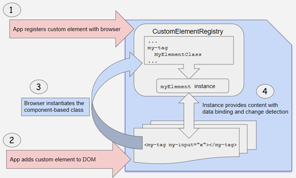
CustomElementRegistry of defined custom elements (also called Web Components), which maps an instantiable JavaScript class to an HTML tag.
The
@angular/elements package exports a createCustomElement() API that provides a bridge from Angular's component interface and change detection functionality to the built-in DOM API.
Transforming a component to a custom element makes all of the required Angular infrastructure available to the browser. Creating a custom element is simple and straightforward, and automatically connects your component-defined view with change detection and data binding, mapping Angular functionality to the corresponding native HTML equivalents.
Using custom elements
Custom elements bootstrap themselves - they start automatically when they are added to the DOM, and are automatically destroyed when removed from the DOM. Once a custom element is added to the DOM for any page, it looks and behaves like any other HTML element, and does not require any special knowledge of Angular terms or usage conventions.
- Easy dynamic content in an Angular appTransforming a component to a custom element provides an easy path to creating dynamic HTML content in your Angular app. HTML content that you add directly to the DOM in an Angular app is normally displayed without Angular processing, unless you define a dynamic component, adding your own code to connect the HTML tag to your app data, and participate in change detection. With a custom element, all of that wiring is taken care of automatically.
- Content-rich applicationsIf you have a content-rich app, such as the Angular app that presents this documentation, custom elements let you give your content providers sophisticated Angular functionality without requiring knowledge of Angular. For example, an Angular guide like this one is added directly to the DOM by the Angular navigation tools, but can include special elements like
How it works
Use the
createCustomElement() function to convert a component into a class that can be registered with the browser as a custom element. After you register your configured class with the browser's custom-element registry, you can use the new element just like a built-in HTML element in content that you add directly into the DOM: message="Use Angular!">
When your custom element is placed on a page, the browser creates an instance of the registered class and adds it to the DOM. The content is provided by the component's template, which uses Angular template syntax, and is rendered using the component and DOM data. Input properties in the component correspond to input attributes for the element.
We are working on custom elements that can be used by web apps built on other frameworks. A minimal, self-contained version of the Angular framework will be injected as a service to support the component's change-detection and data-binding functionality. For more about the direction of development, check out this video presentation.
Transforming components to custom elements
Angular provides the
createCustomElement() function for converting an Angular component, together with its dependencies, to a custom element. The function collects the component's observable properties, along with the Angular functionality the browser needs to create and destroy instances, and to detect and respond to changes.
The conversion process implements the
NgElementConstructor interface, and creates a constructor class that is configured to produce a self-bootstrapping instance of your component.
Use a JavaScript function,
customElements.define(), to register the configured constructor and its associated custom-element tag with the browser's CustomElementRegistry. When the browser encounters the tag for the registered element, it uses the constructor to create a custom-element instance.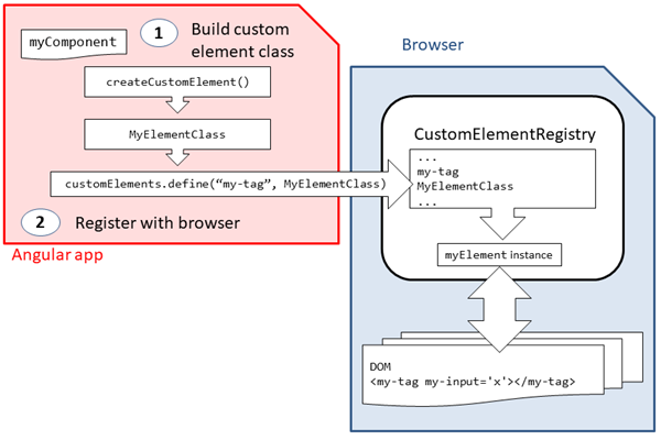
Mapping
A custom element hosts an Angular component, providing a bridge between the data and logic defined in the component and standard DOM APIs. Component properties and logic maps directly into HTML attributes and the browser's event system.
- The creation API parses the component looking for input properties, and defines corresponding attributes for the custom element. It transforms the property names to make them compatible with custom elements, which do not recognize case distinctions. The resulting attribute names use dash-separated lowercase. For example, for a component with
@Input('myInputProp') inputProp, the corresponding custom element defines an attributemy-input-prop. - Component outputs are dispatched as HTML Custom Events, with the name of the custom event matching the output name. For example, for a component with
@Output() valueChanged = newEventEmitter(), the corresponding custom element will dispatch events with the name "valueChanged", and the emitted data will be stored on the event’sdetailproperty. If you provide an alias, that value is used; for example,@Output('myClick') clicks = new EventEmitterresults in dispatch events with the name "myClick".();
For more information, see Web Component documentation for Creating custom events.
Browser support for custom elements
The recently-developed custom elements Web Platform feature is currently supported natively in a number of browsers. Support is pending or planned in other browsers.
| Browser | Custom Element Support |
|---|---|
| Chrome | Supported natively. |
| Opera | Supported natively. |
| Safari | Supported natively. |
| Firefox | Set the dom.webcomponents.enabled and dom.webcomponents.customelements.enabledpreferences to true. Planned to be enabled by default in version 60/61. |
| Edge | Working on an implementation. |
In browsers that support Custom Elements natively, the specification requires developers use ES2015 classes to define Custom Elements - developers can opt-in to this by setting the
target: "es2015" property in their project's tsconfig.json. As Custom Element and ES2015 support may not be available in all browsers, developers can instead choose to use a polyfill to support older browsers and ES5 code.
Use the Angular CLI to automatically set up your project with the correct polyfill:
ng add @angular/elements --name=*your_project_name*.- For more information about polyfills, see polyfill documentation.
- For more information about Angular browser support, see Browser Support.
Example: A Popup Service
Previously, when you wanted to add a component to an app at runtime, you had to define a dynamic component. The app module would have to list your dynamic component under
entryComponents, so that the app wouldn't expect it to be present at startup, and then you would have to load it, attach it to an element in the DOM, and wire up all of the dependencies, change detection, and event handling, as described in Dynamic Component Loader.
Using an Angular custom element makes the process much simpler and more transparent, by providing all of the infrastructure and framework automatically—all you have to do is define the kind of event handling you want. (You do still have to exclude the component from compilation, if you are not going to use it in your app.)
The Popup Service example app defines a component that you can either load dynamically or convert to a custom element.
popup.component.tsdefines a simple pop-up element that displays an input message, with some animation and styling.popup.service.tscreates an injectable service that provides two different ways to invoke the PopupComponent; as a dynamic component, or as a custom element. Notice how much more setup is required for the dynamic-loading method.app.module.tsadds the PopupComponent in the module'sentryComponentslist, to exclude it from compilation and avoid startup warnings or errors.app.component.tsdefines the app's root component, which uses the PopupService to add the pop-up to the DOM at run time. When the app runs, the root component's constructor converts PopupComponent to a custom element.
For comparison, the demo shows both methods. One button adds the popup using the dynamic-loading method, and the other uses the custom element. You can see that the result is the same; only the preparation is different.
Comments
Post a Comment